
Color Theory in Graphic Design: Creating Powerful Visual Identities
In the vibrant realm of graphic design, colors play an unparalleled role in shaping powerful visual identities. Color theory, an indispensable component of graphic design, is the art and science of using color to create harmonious, appealing, and emotionally resonant visuals. In this comprehensive guide, we'll explore the multifaceted facets of Color Theory in Graphic Design: Creating Powerful Visual Identities.
Introduction
The colors we encounter in our daily lives have a profound impact on our emotions, decisions, and perceptions. In the world of graphic design, understanding the intricacies of color theory is paramount to crafting visual identities that captivate audiences and convey messages effectively.
The Significance of Color in Graphic Design
Color theory forms the bedrock of graphic design, influencing every aspect of the creative process. From choosing a color palette for a brand's logo to creating captivating marketing materials, designers leverage color theory to evoke specific emotions, establish brand recognition, and engage their target audience.
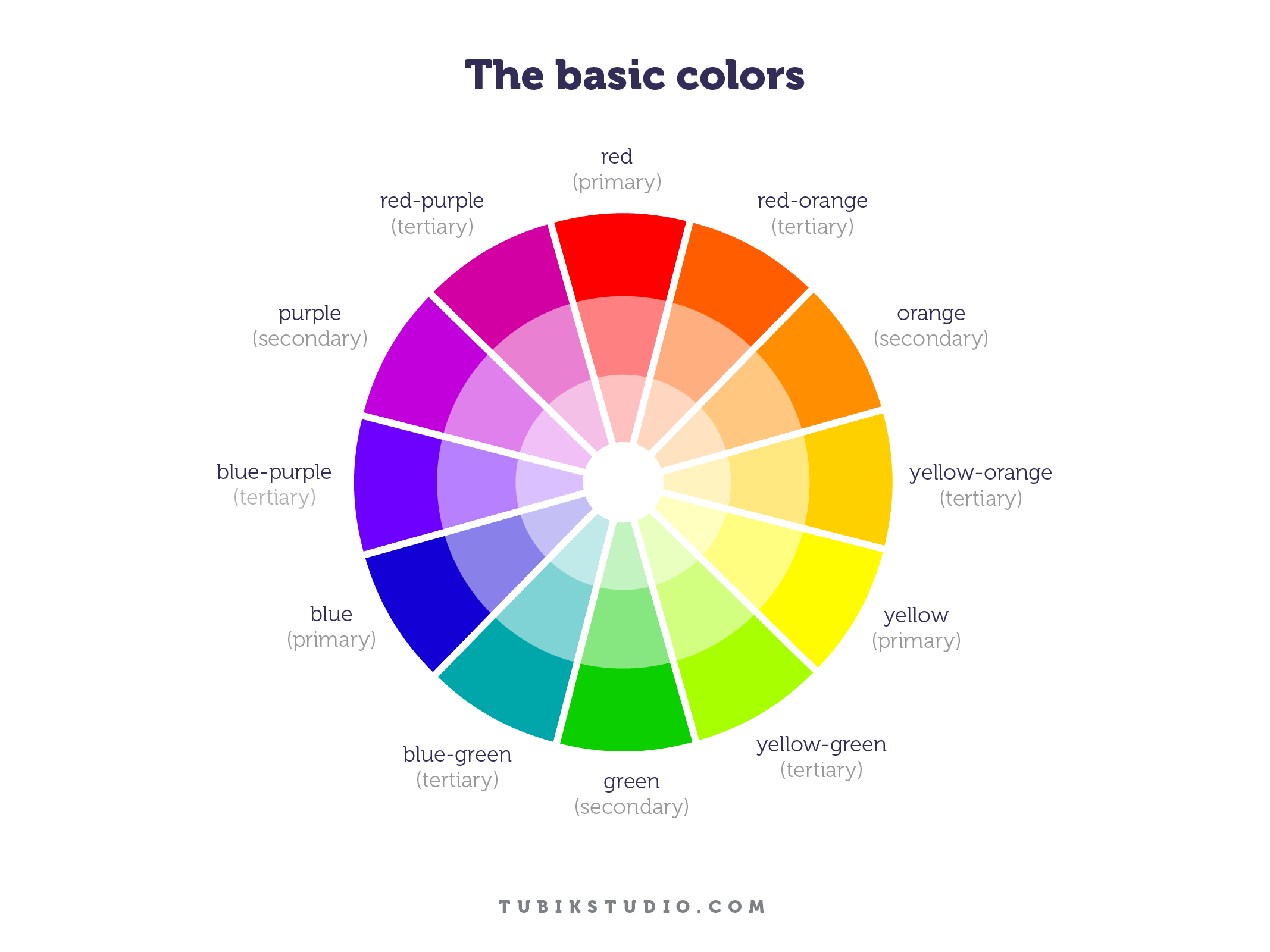
Exploring the Color Wheel
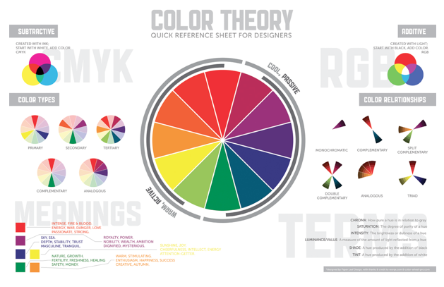
At the heart of color theory lies the color wheel, a visual representation of the relationships between colors. Understanding the color wheel is essential for graphic designers as it helps them create visually pleasing combinations and achieve balance in their designs. The primary colors—red, blue, and yellow—are the foundation upon which all other colors are built.
The Role of Hues, Tints, and Shades
Hues are pure colors, while tints are created by adding white, and shades are achieved by adding black. This spectrum of possibilities allows designers to fine-tune their color choices, ensuring they align with the desired brand identity and message.
Color Harmony and Contrast
Achieving color harmony and contrast is pivotal in graphic design. Harmonious color schemes create a sense of cohesion and balance, while strategic use of contrast can draw attention to specific elements within a design. The choice between complementary, analogous, or monochromatic color schemes depends on the intended message and emotional impact.
The Psychology of Colors
Colors have the remarkable ability to evoke emotions and convey messages without words. For example, red symbolizes passion and excitement, while blue conveys trust and professionalism. Understanding the psychology behind colors allows designers to harness their power effectively.
Color Theory in Branding
Successful brands are instantly recognizable, often due to their distinctive color schemes. Think of Coca-Cola's bold red or Facebook's soothing blue. These color choices are not arbitrary; they are carefully selected to reflect the brand's values and evoke specific emotions in consumers.
Case Studies: Iconic Brand Colors
Coca-Cola's Classic Red: The vibrant red color signifies energy, excitement, and the joy of sharing moments. It has helped Coca-Cola become a global icon.
Facebook's Calming Blue: The tranquil blue hues of Facebook convey trustworthiness and create a sense of community, making it a familiar and welcoming platform.
Color Theory in Visual Communication
Visual communication relies heavily on color theory to convey complex ideas quickly and effectively. Whether it's designing infographics, websites, or advertisements, understanding how colors interact with each other and the viewer is essential.
FAQs
Q: How does color impact consumer purchasing decisions? A: Color psychology suggests that different colors can influence buying behavior. For example, warm colors like red and yellow can create a sense of urgency, while green and blue can promote feelings of trust and relaxation.
Q: Can color choices affect website usability? A: Absolutely. The right color combinations can enhance readability and usability. For instance, using high-contrast colors for text and background can improve the user experience.
Q: Are there cultural differences in color symbolism? A: Yes, color meanings can vary across cultures. For instance, while white represents purity in Western cultures, it symbolizes mourning in some Asian cultures.
Q: How can businesses choose the right colors for their branding? A: Businesses should consider their target audience, industry, and brand personality when selecting colors. Conducting market research and understanding the competition can also provide valuable insights.
Q: What are some common mistakes in color choice for graphic design? A: One common mistake is using too many colors, which can overwhelm the viewer. Another is neglecting color accessibility, which can alienate users with visual impairments.
Q: Can color theory be applied to non-visual mediums, like music? A: Yes, color theory can inspire creativity in various art forms, including music. Musicians often use color metaphors to describe the mood and tone of their compositions.
Conclusion
Color Theory in Graphic Design: Creating Powerful Visual Identities is a dynamic field that merges artistry with science. By mastering color theory, designers can breathe life into their creations, leaving a lasting impact on audiences and reinforcing brand identities.
Unlock the potential of color in your graphic design journey, and watch as your visual identities become truly powerful and resonant.
0 Comments